

Character Design in a Nutshell
Jun 9th 2020
Today I was looking at some videos to learn more about character design and I decided to take notes.
Then I thought… Hmm, these notes are probably useful to many people. Why don’t you put them in a blog post!
This is it…
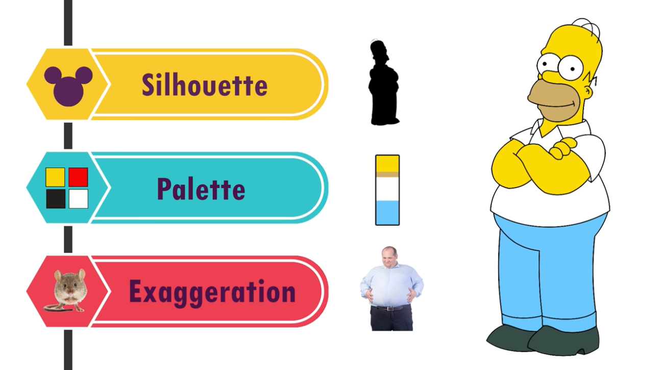
Aspects to consider at the moment of defining a character are:
- Silhouette
- Color
- Exaggeration
- Pose
- Body variety
- Appeal
- Lineup
Silhouette
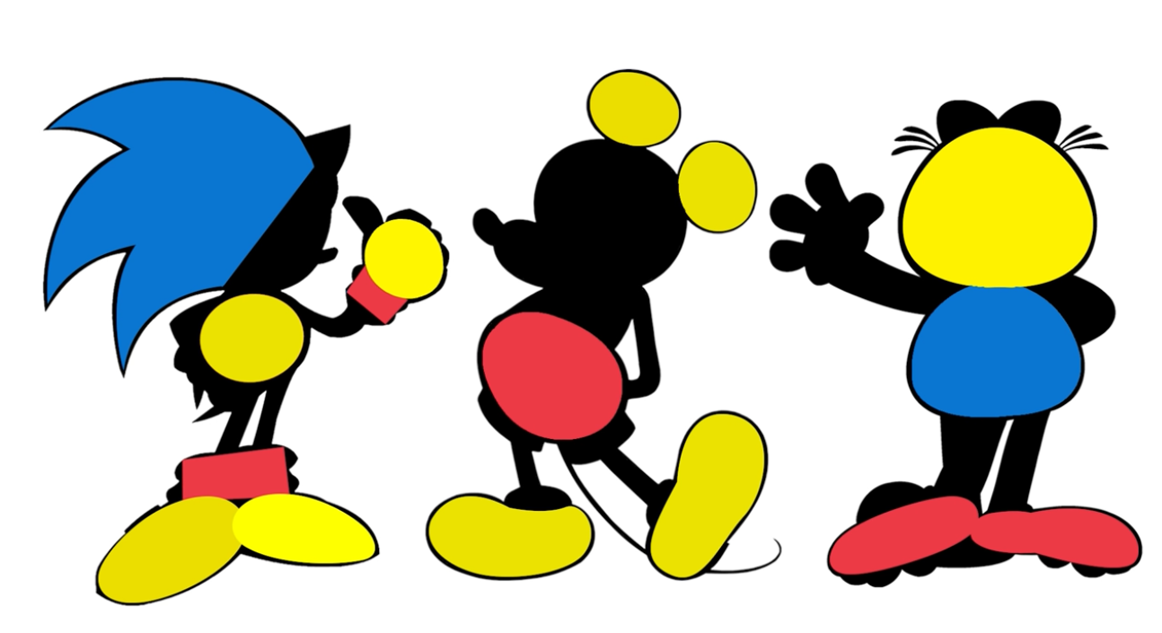
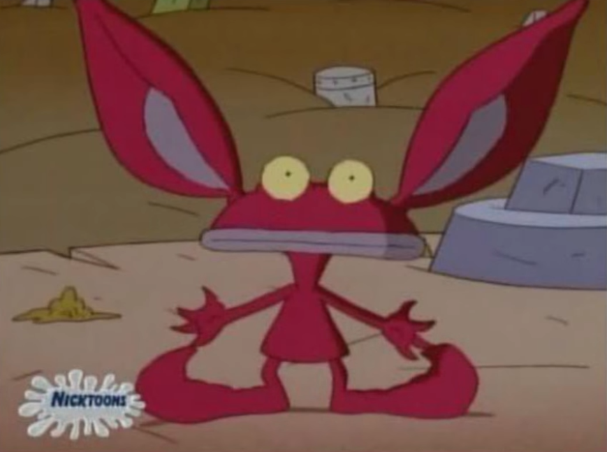
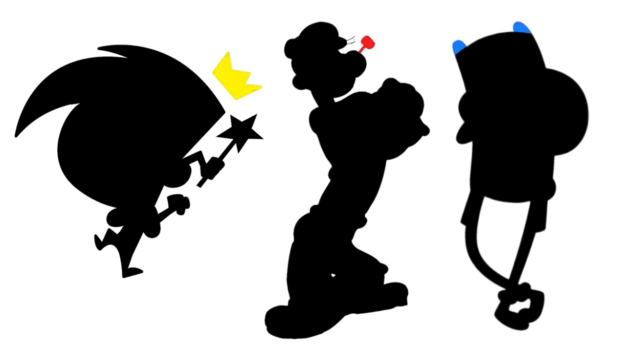
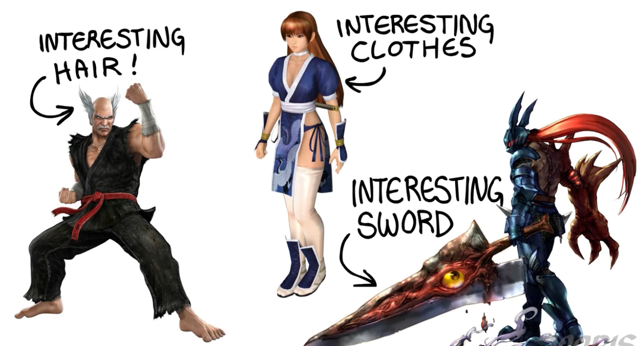
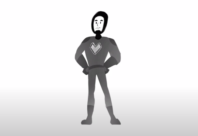
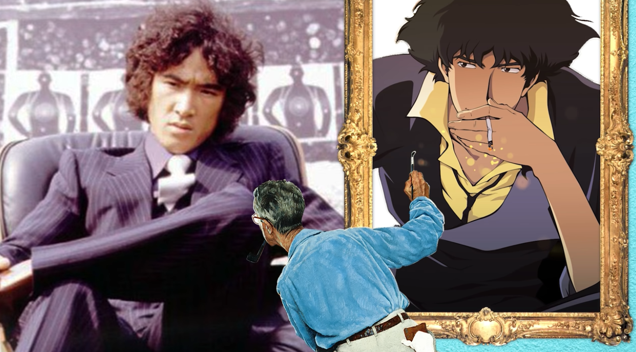
A character must be recognizable from the silhouette alone.
Tip: Tint to black and check if its recognizable or not
The silhouette should have big identifiable shapes.
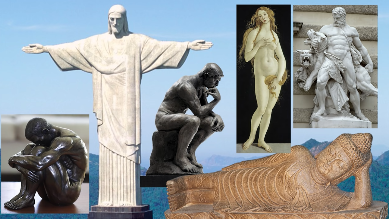
Different shapes evoke different perceptions:
Shape
Square
- Stability
- Trust
- Stubbornness
Circle
- Friendly
- Bouncy
- Soft
- Welcoming
- Happy
Triangle
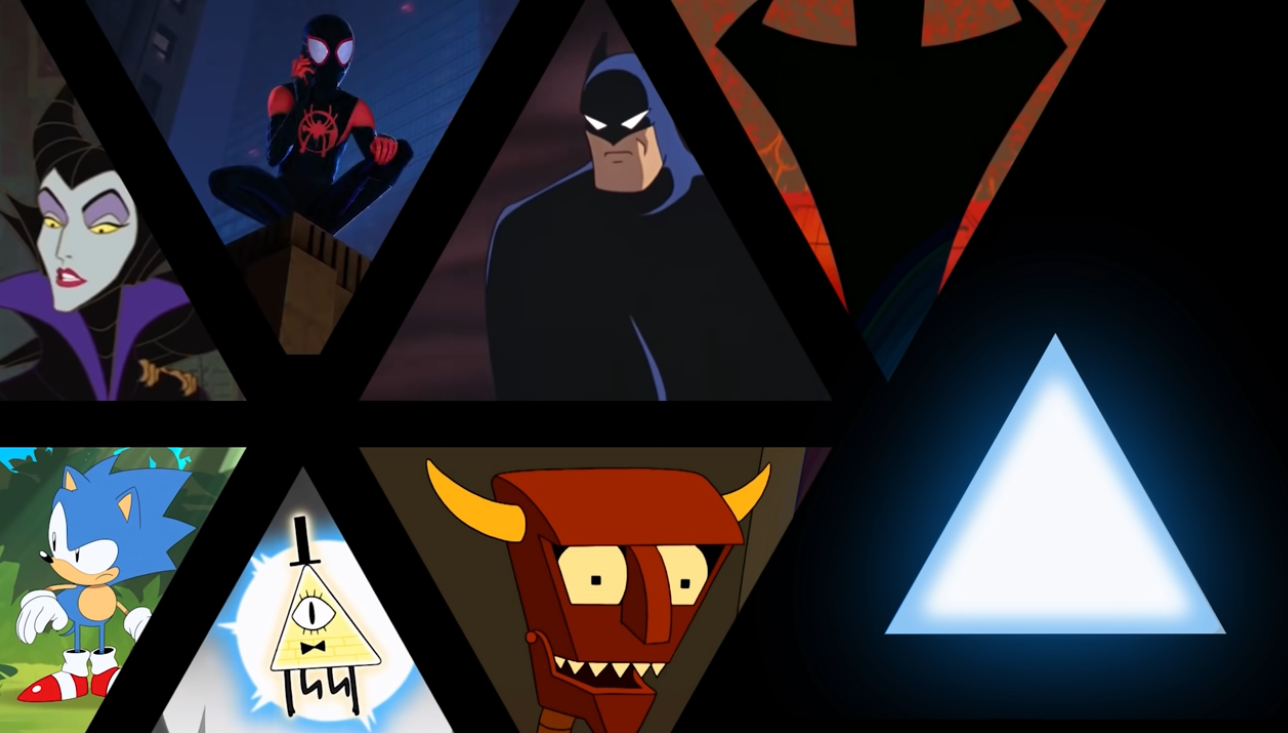
- Edginess
- Danger
- Intensity
- Speed

Choose a shape motif to reduce clutter and stick with it.
About shape details
Use simple few big shapes.
Many small shapes are harder to read, draw, and don’t communicate much.
Add a weird unique shape to part of the character improves silhouette clarity.
Color
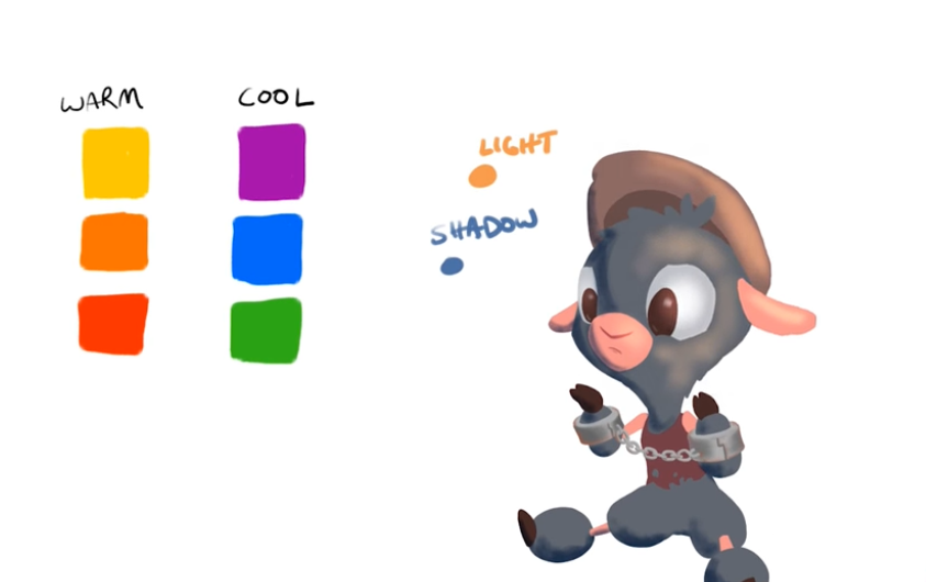
HSV: Hue Saturation Value
Just as you can define a point in the space by (x, y) in cartesian coordinates and (angle, radius) in polar coordinates, you can also define colors with (r, g, b) and (h, s, v).
HSV is much more useful at the moment of picking colors.
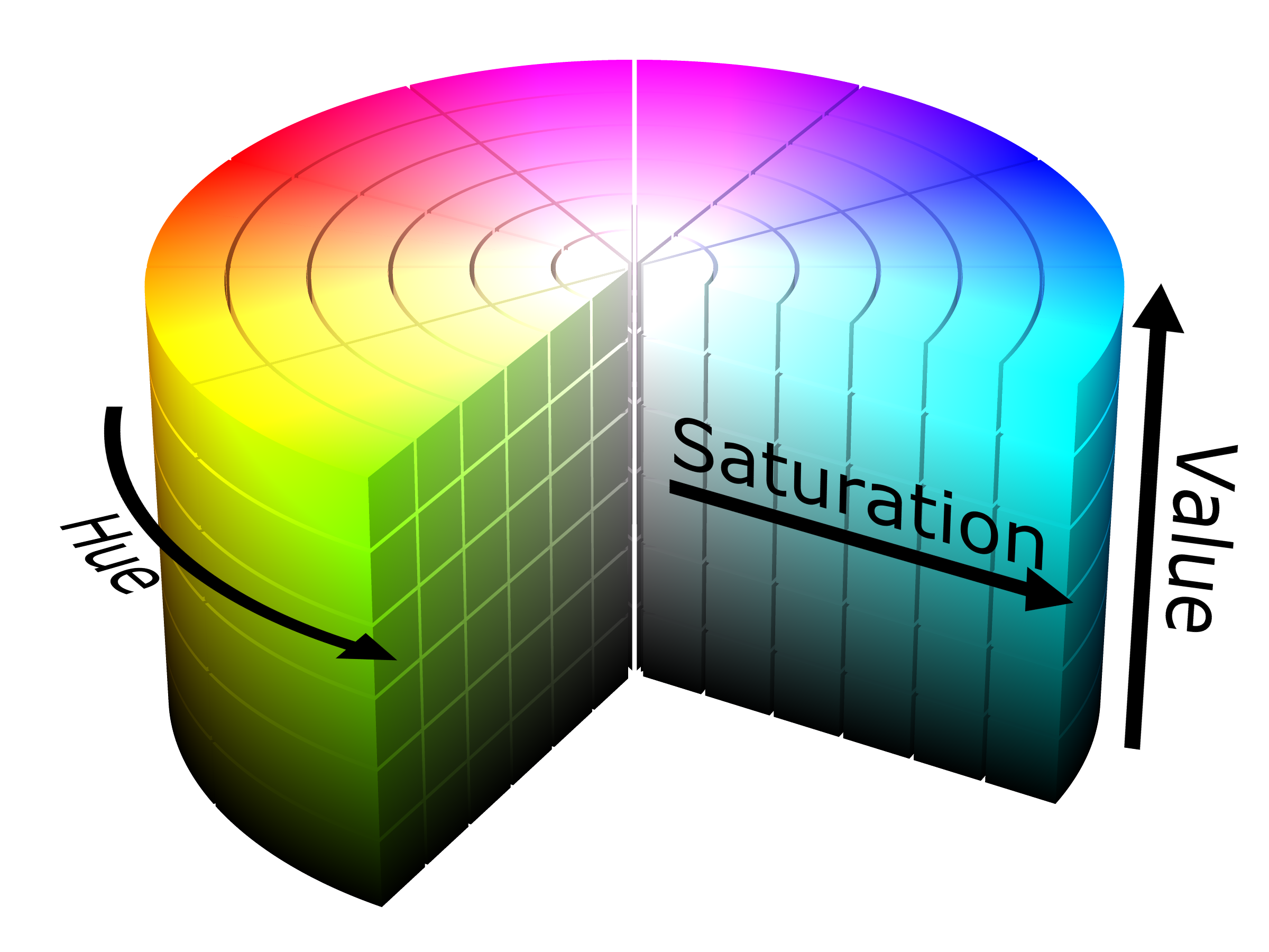
What are they?
- Hue: Dominant wavelength. The flavor of the color along the spectrum.
- Saturation: Dominance of hue in the color
- Value: Lightness/Darkness
Color selection
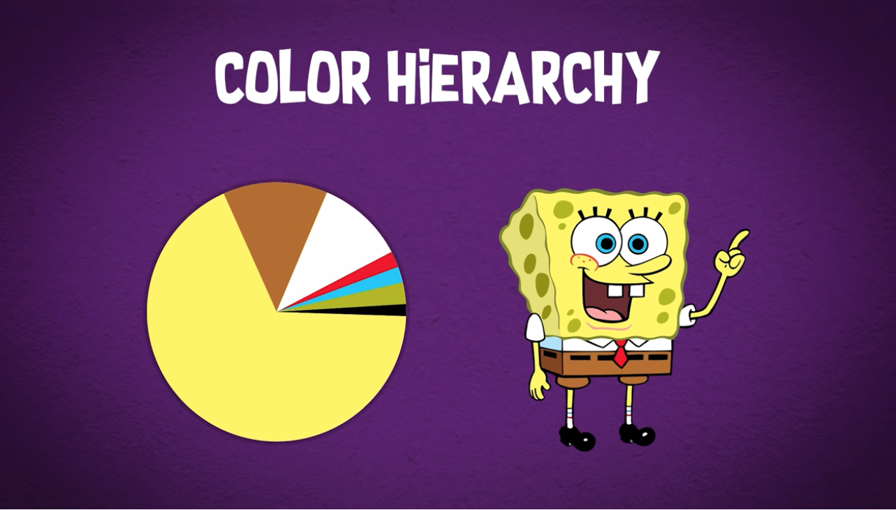
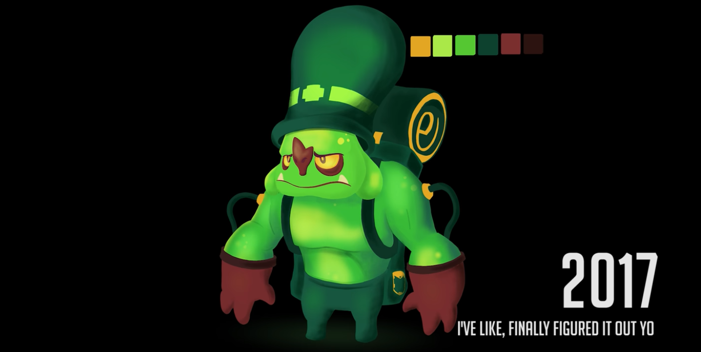
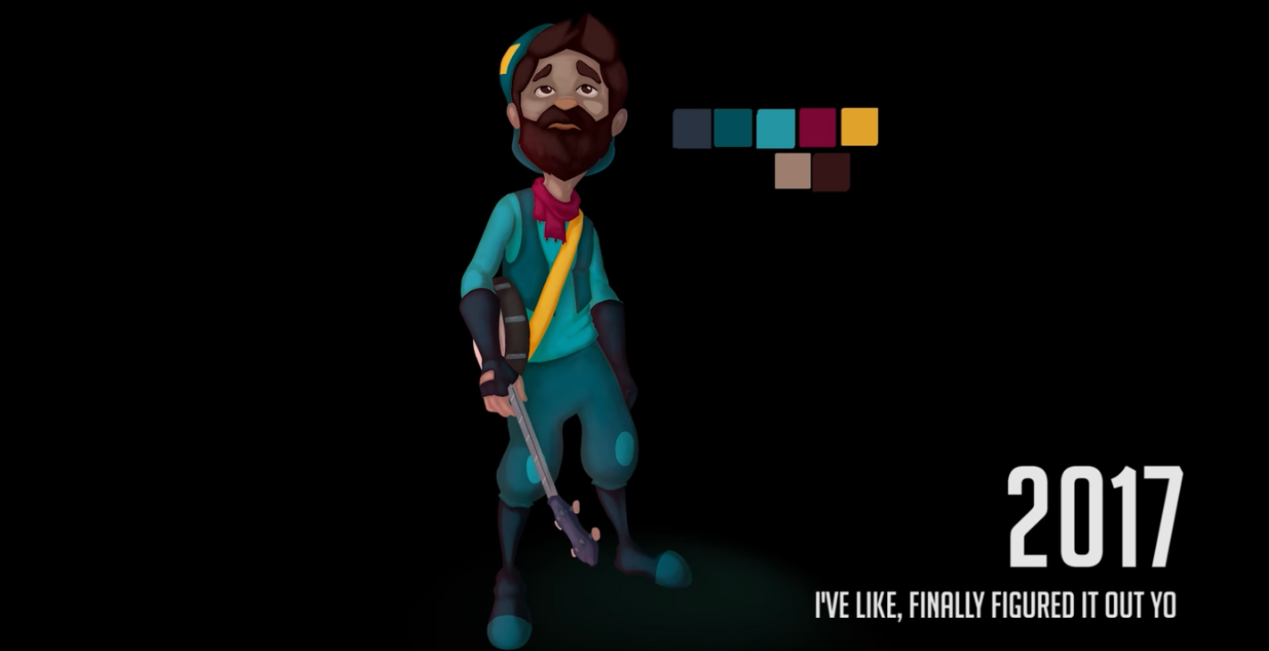
One color should be dominant, the rest should be supportive without competing.
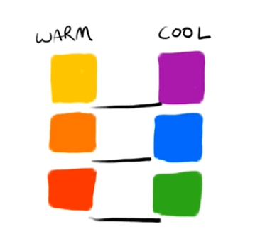
Colors shouldn’t compete. Colors of distinguishable elements shouldn’t have the same temperature. Try making them complementary instead.
Color values inside the character should not be similar.
Difference between value colors creates contrast, which attracts the attention of the eye.
Use that to build the hierarchy of imprtance of the character. Attract the attention to what makes the character iconic.
The high value high saturation color (dominant color) is screaming at your eyes “look at me!”. Use it carefully.
Using analogous + complementary palette its a good idea.
Explore color harmonies here.
75% analogous, 25% complementary is a good proportion.
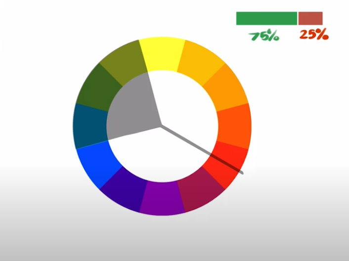
Analogous colors can be used to makes shades from higher (light) to lower value (dark).
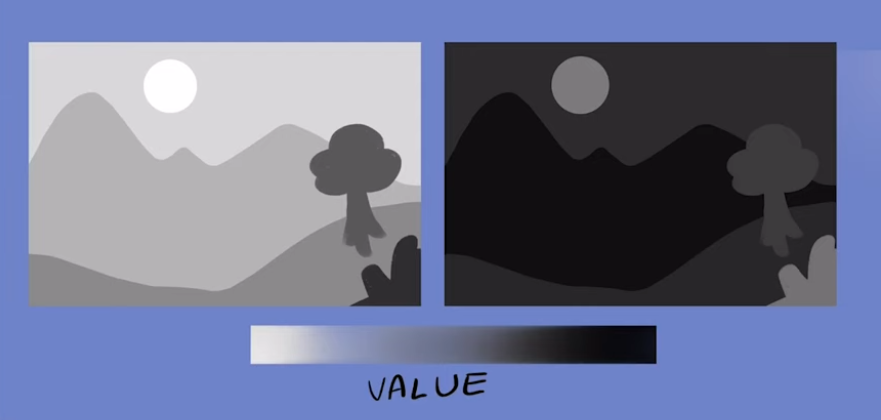
Color value in background vs foreground
In day landscapes value of background should be higher than the foreground.
This makes also the character distinguishable from the background.
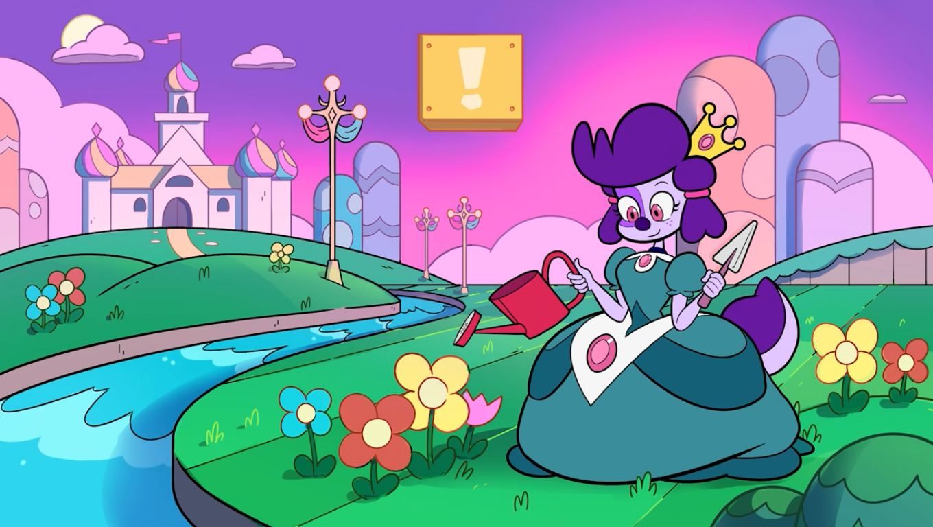
In night landscapes value of the background should be lower than the foreground.
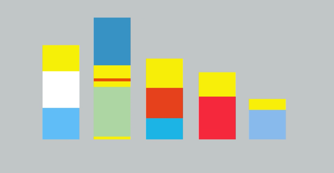
Rectangular swatches
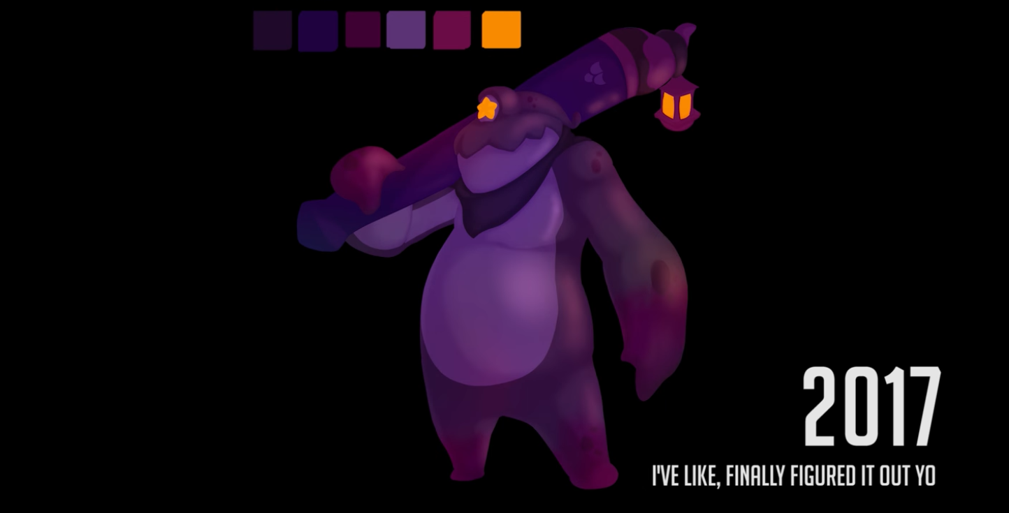
A good design palette makes your character to be totally recognizable from rectangular swatches alone.
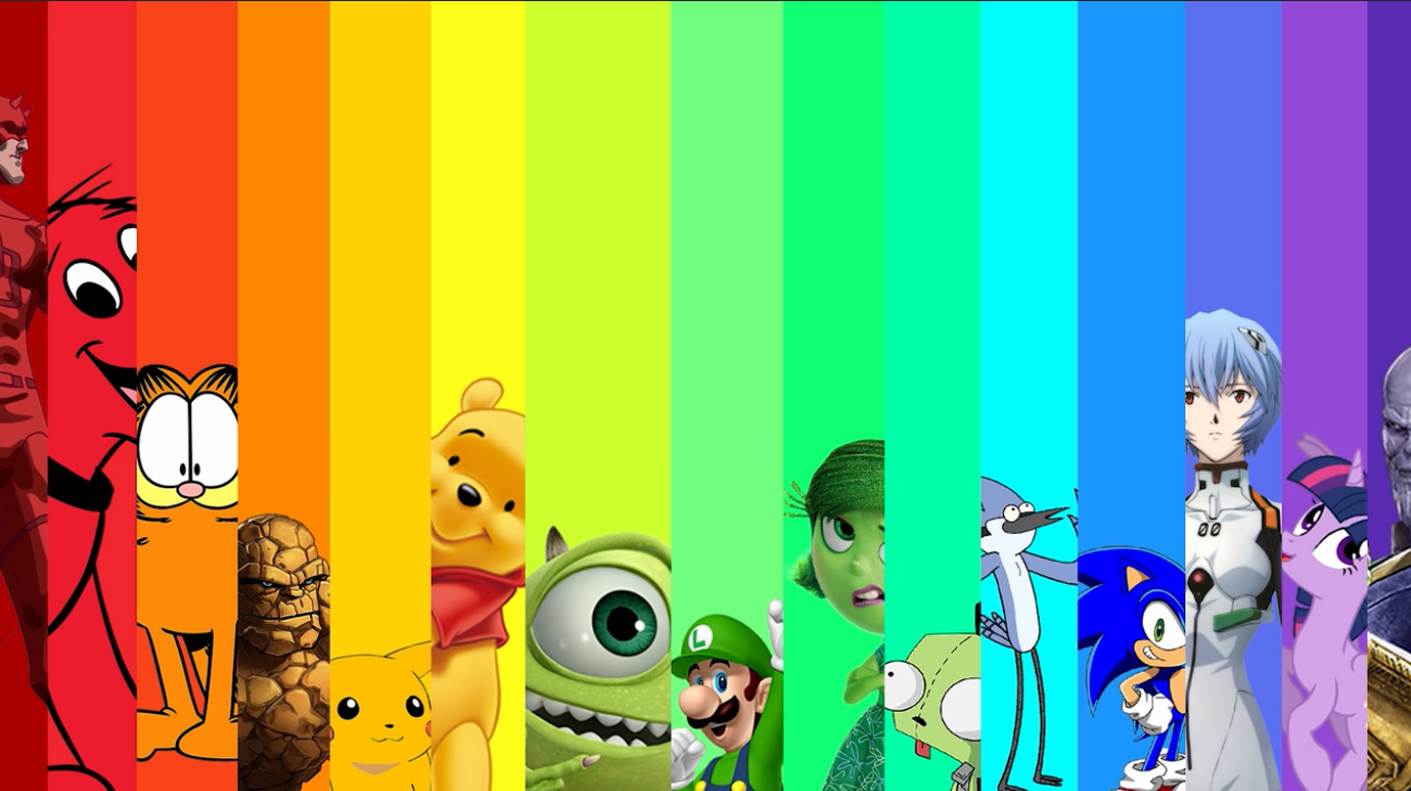
Colors evoke certain moods
Color language is not that clear as shape language buy it tells a story of the character.
- Yellow
- Joy
- Happiness
- Sickness
- Green
- Safety
- Red
- Danger
- Sexy
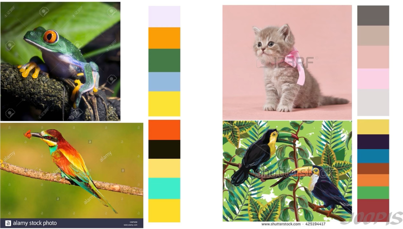
TIP: Color palettes can be taken from nature to evoke the animal’s feeling.
Exaggeration
Exaggerate the expression of the character to evoke the intended emotion.
Pose
Pose itself evokes certain emotions and personal characteristics.
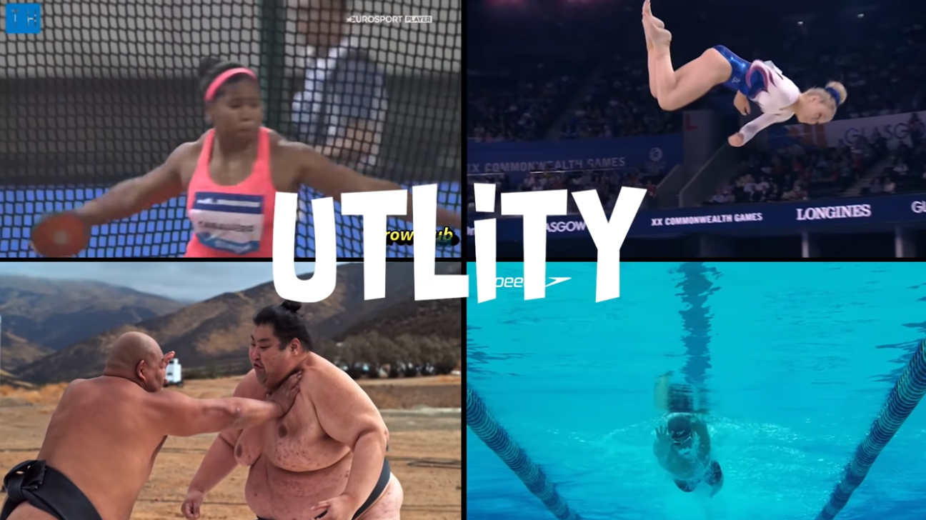
Body variety
The body should follow the utility of the character. What is it good for.
Appeal
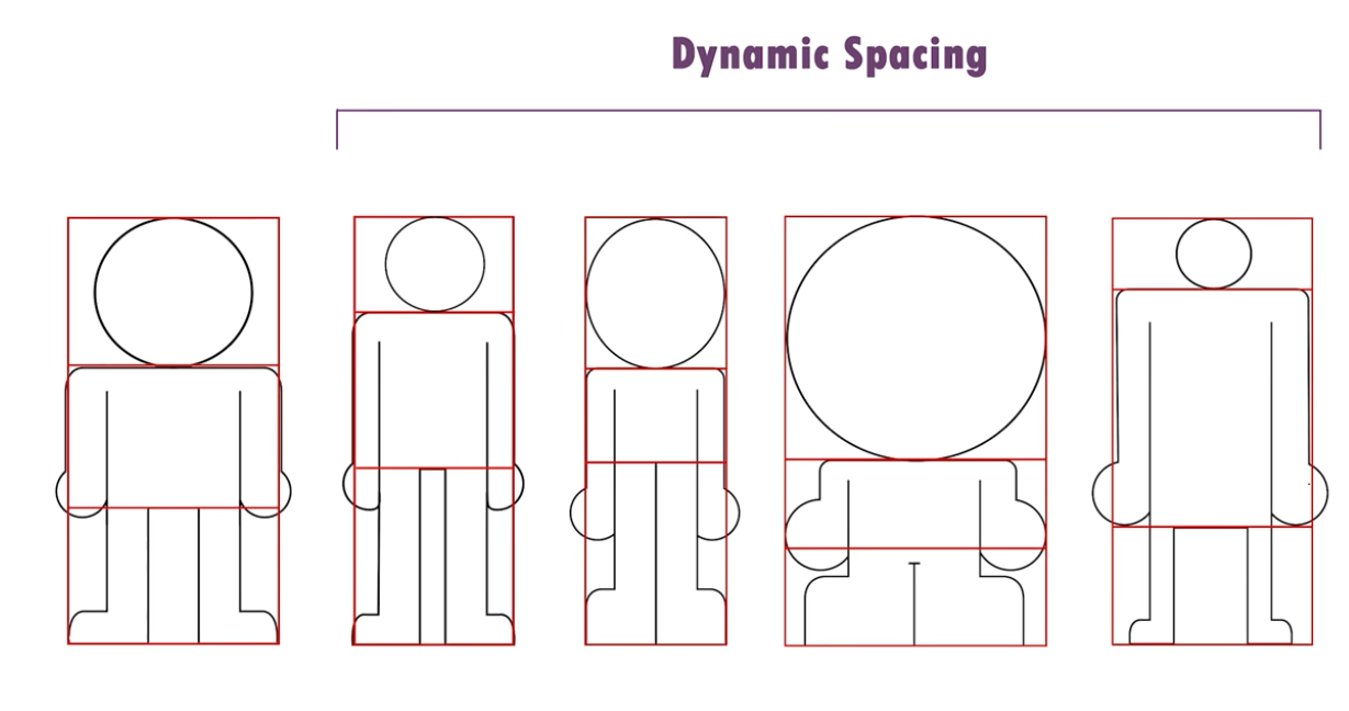
The size of the head, torso, and legs defines the appeal of your character.
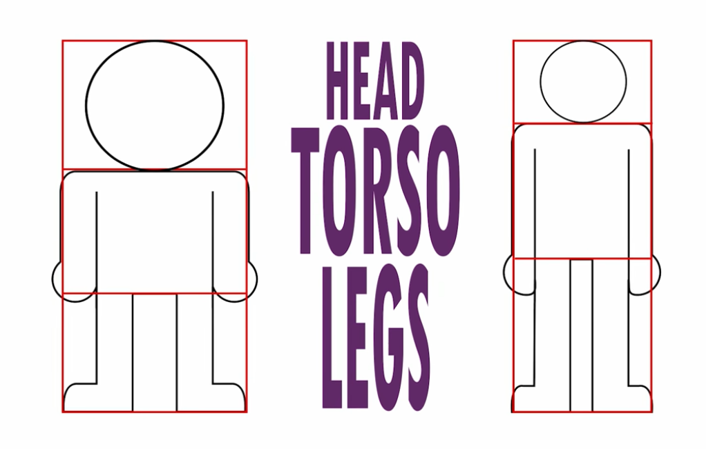
A character with a bigger dynamic space is more appealing.
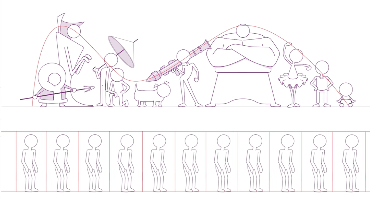
Lineup
Design character in a lineup to avoid proportion problems between characters.
A good character design should look like a rollercoaster.
Sources
I made this post from taking notes of videos and researching on the internet.
This is just a compilation.
There are pretty cool people teaching all this. Please consider follow or donate.
This is a list of some of the videos I took screenshots from and their respective links to follow/donations: